project overview
〰️
project overview 〰️
the product
The product includes a dedicated mobile app and website design for spa customers looking to book services at their favorite spa (the ALKI!)
project duration
October 2025 through December 2025
the problem
Lindsey is a busy and stressed individual who needs an easy and convenient way to book spa services because it will allow her to relax.
the goal
Our spa booking app will allow users to easily and conveniently find and book spa services, which will help users with high levels of stress by creating a streamlined way to book services from the comfort of their own home (computer) or on-the-go (mobile phone).
my role
This was a solo project so everything in the project was completed by me.
The responsiblites of this project included the user research, paper wireframes, digital wireframes, low-fidelity prototypes, high-fidelity prototypes, accessibility considerations, and even the creation of this website!
responsibilities
user research
〰️
user research 〰️
user persona — katie
BACKGROUND
Katie, 30, works full time at a fulfilling but demanding job which leads to her carring tension in her body, espcially her shoulders. She values self-care and therefore is excited when she finds convinient ways to destress.
GOALS - Katie wants an easy and convenient way to book spa services in order to relax.
FRUSTRATIONS - Katie struggles to find time to book spa services during her busy schedule
PROBLEM STATEMENT
Katie is a busy professional who needs a reliable and convinient way to book spa appointments because it will allow her to do this at times that work with her packed schedule.
“I barely have a minute between meetings, so I find it hard to organize times to destress”
pain points
1
UNCLEAR SERVICES
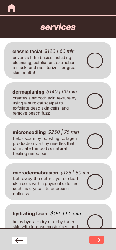
Users struggle to understand service meanings and differences when there is no description when they attempt to book appointments.
This can be provided by adding a services details page to our website and including service descriptions within the booking menus.
2
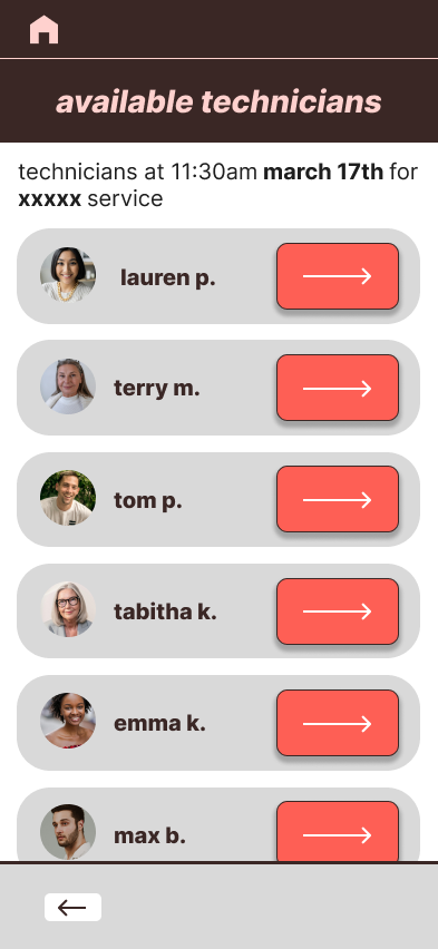
CALL TO BOOK
Users finds it inconvenient to have to call to book spa services as she doesn’t always have access to a quiet and private space. Some users also experience social anxiety and prefer to book appointments online over calling.
This can be remedied by our app as it allows users to book appointments online without calling.
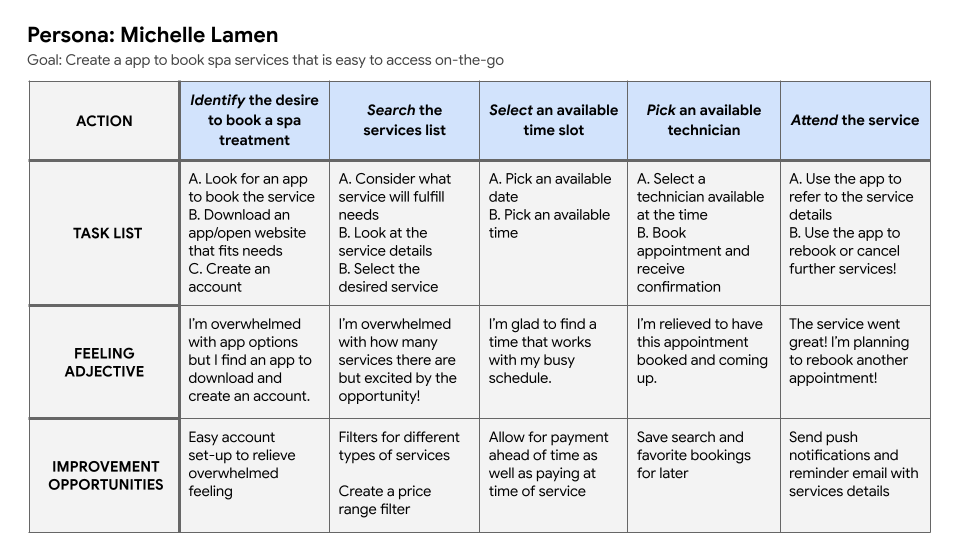
user journey map
design stages
〰️
design stages 〰️
paper wireframes
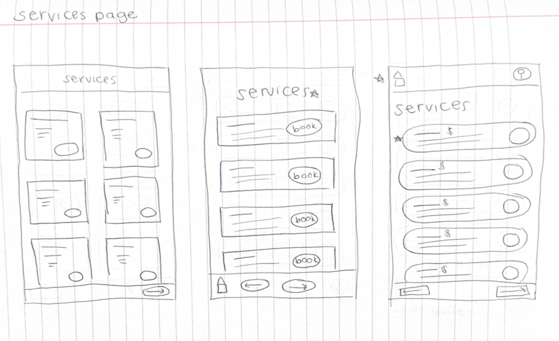
These images mark the start of the wireframing process for this project. I began by translating my user research into tangible layouts, focusing on visual hierarchy and design clarity. After creating five initial drafts, I reviewed them carefully and highlighted the strongest elements. The final 'star draft' brings together these standout components into a cohesive blueprint for the app.
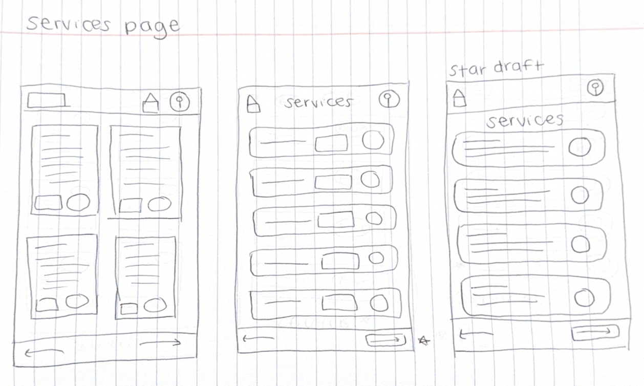
digital wireframes
In the next step, digital wireframes, I worked to create the app’s basic layout and flow. I began with the best design elements from my paper wireframes, focusing on having clear visual cues to progress through the app, even before adding color. This helps provide a more accessible flow for all users.
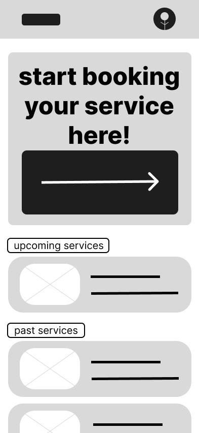
low-fidelity prototype
These low-fidentlity prototypes allowed me to start adding color to further direct users how to progress through the app. A bright red color was added to all Call-To-Action buttons that moved the user onto the next page.
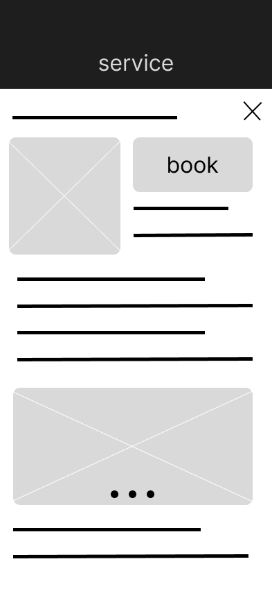
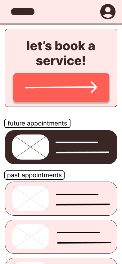
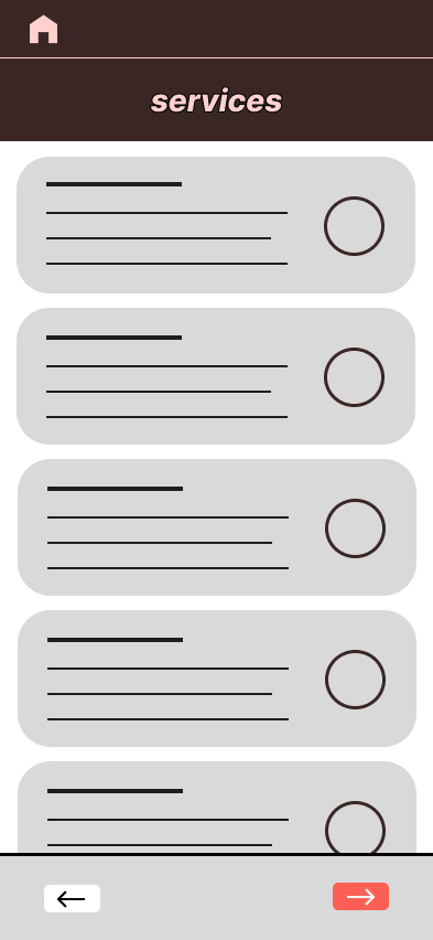
high-fidelity prototype
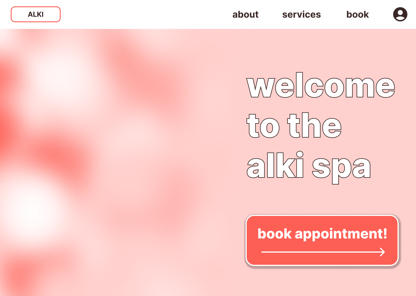
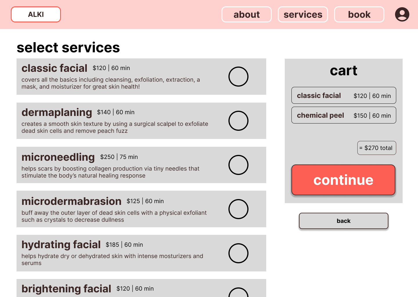
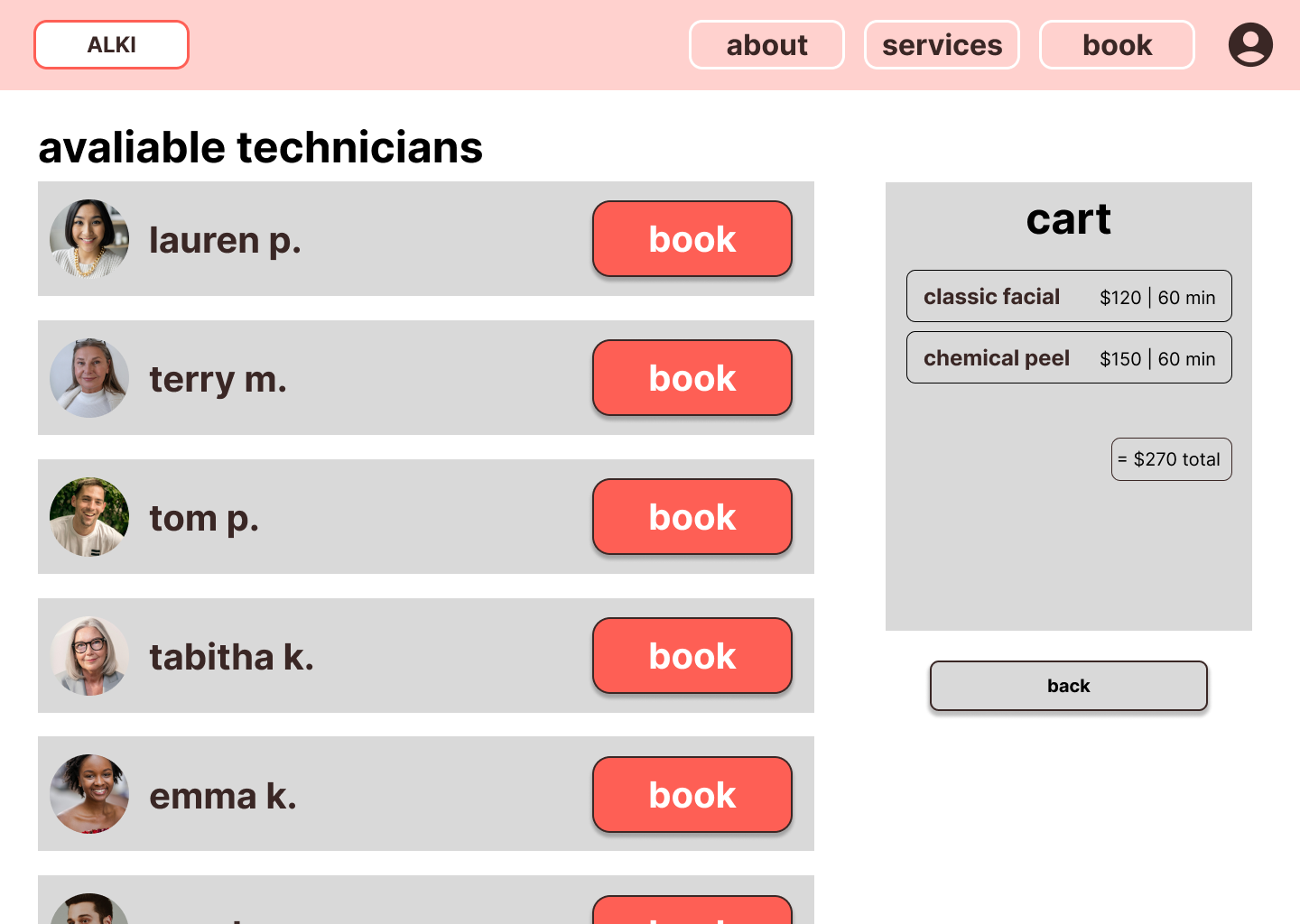
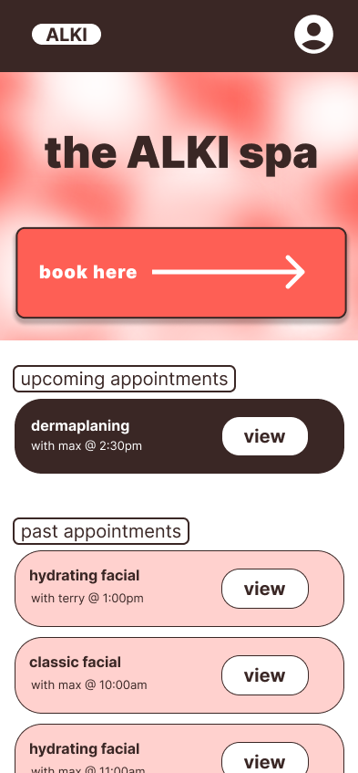
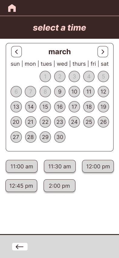
After several rounds of editing and feedback, the final design of the ALKI spa website and app features a user-centered design, prioritizing intuitive navigation and thoughtful accessibility features. The final product balances a calming, spa-inspired aesthetic with functional, goal-driven design decisions that support both user needs and business objectives.
accessibility considerations
1
INCLUSIVE IMAGERY & LANGUAGE
To target inclusive imagery and language, service descriptions avoid gendered assumptions and visual assets reflect diverse ages, body types, and skin tones to ensure representation and belonging.
2
VISUAL ACCESIBILITY
To support users with low vision or visual impairments, I prioritized strong color contrast and legible typography throughout the interface. Text meets accessibility contrast standards, and important information is never communicated through color alone, often using
3
ACCESSIBLE LABELS & FORMATTING
Accesible labels and formatting were inlcuded in this design thorugh clear, descriptive labels, logical headings and consistent formatting. This supports the user of screen readres and overall readablity.